
Rhys Greenland | The World Cup kit has become a country’s second flag

A World Cup shirt has to do more work than almost any other piece of sportswear.
It must look good from the top tier of a stadium and on a phone screen. It must satisfy the federation, the manufacturer, the players, the collectors and the casual fan. It must respect national identity without becoming a museum piece. It must be new, but not too new. Familiar, but not lazy.
Over time, football shirts have exhibited a wider migration into music, fashion and fan culture. Wearing jerseys for day-to-day activities is perfectly normal, and these shirts have become objects worn well beyond matchday. This is only blown up even further at a World Cup when the spotlight is on, and billions are watching.
Belgium’s away shirt may be the clearest example from this tournament. Town & Country reported that Belgium’s 2026 away jersey, made with Adidas, is a tribute to René Magritte, a famous Belgian surrealist artist. The shirt uses a blue base with pink and blue spheres inspired by Magritte’s 1931 painting The Voice of Space, and carries the phrase “Ceci n’est pas un maillot” – “This is not a jersey.” at the collar, a reference to Magritte’s famous “This is not a pipe” idea.
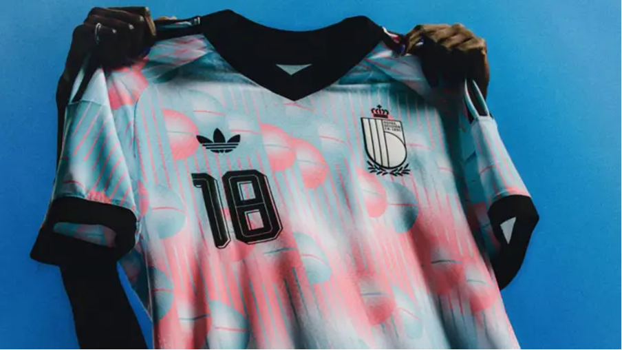
This is widely regarded as a good example of a shirt, rather than being a forgettable strip, it made a national joke, an art-history reference and a football shirt at the same time. Whether one likes it or not, it has a reason to exist.
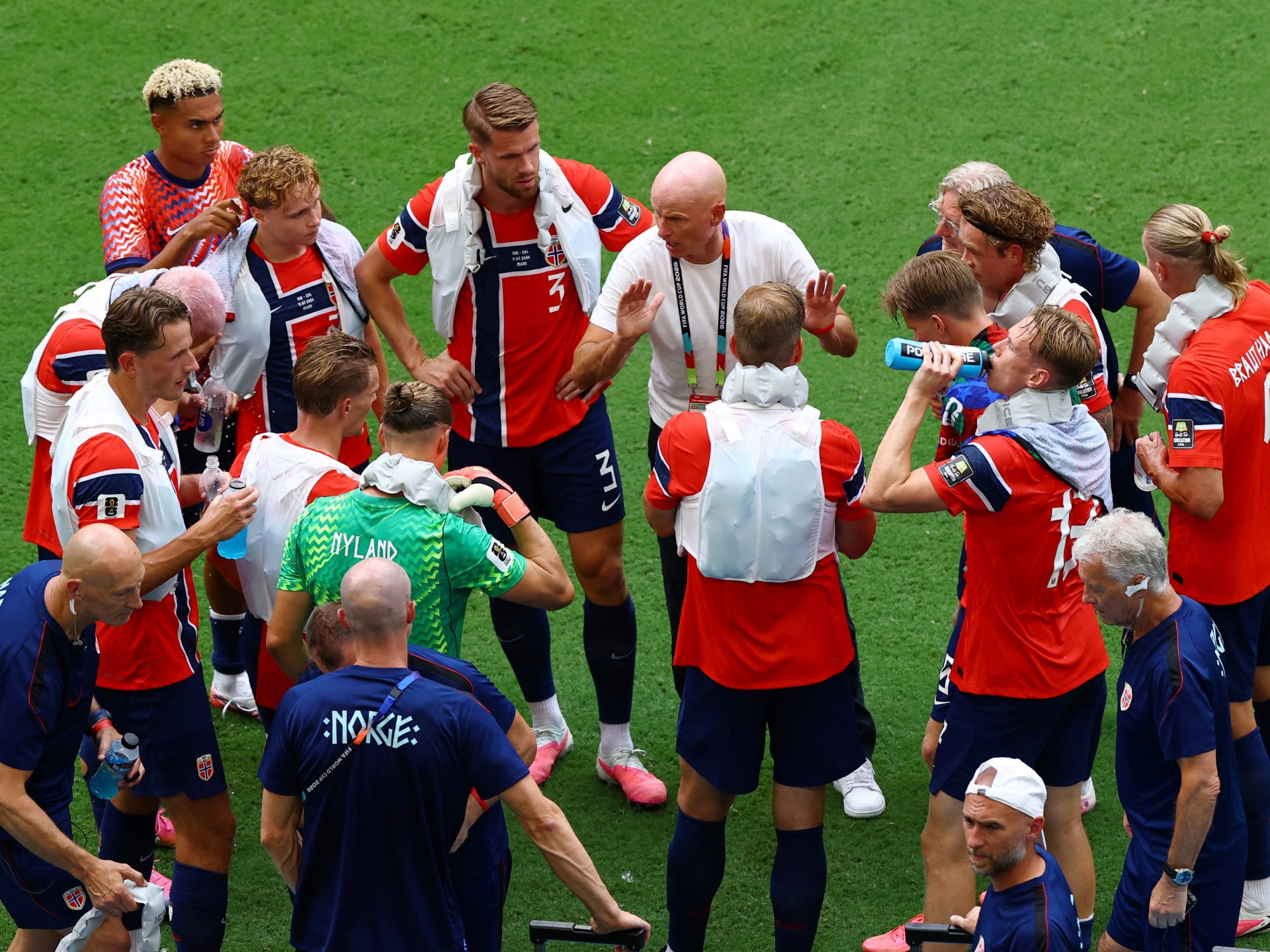
A shirt does not become meaningful because there is a graphic across the front. It becomes meaningful when the graphic belongs to the country wearing it. Another great example is the Norway jersey, characterised by the runic font.

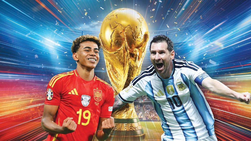
This is why the classics endure. Spain in red does not need much explanation. France or “Les Bleus” carries state, history and expectation. Argentina’s stripes remain among the most recognisable images in sport. Brazil’s yellow, for all the political and emotional weight it has carried at different times, is still one of football’s strongest visual identities. The Netherlands’ “Oranje” and, of course, England’s Three Lions crest on a white home jersey and an ever-present red away kit, to honour their 1966 victory.
There is a long history here. Kits have carried politics, commerce and identity across tournaments, from early symbolic designs to the arrival of visible sportswear branding in the 1970s, including the famous conflict around Cruyff’s two-stripe Netherlands shirt in 1974. The World Cup shirt is many things in one: a flag, a product, a souvenir, a photograph, a rebellion and sometimes a mistake. A good kit should make the player look as if he belongs to something larger than himself, while a great one should make the supporter feel the same.
Syndicated from Our Today · originally published .
Legal context · powered by Jurifi
Get the legal angle on this story. Pick a prompt and Jurifi's AI will explain it using Jamaican law.
AI replies are based on Jamaican law via Jurifi. Not legal advice.